On Point is a programme created to support young people through sport, wellbeing, and community connection. Partnering with ACC, the initiative needed a bold identity that could cut through youth culture, capture their energy, and empower them to see sport as a pathway for growth and resilience. I developed a brand system that combined precision, movement, and cultural relevance to bring this kaupapa to life.
The Challenge
Design a brand identity that feels fresh, dynamic, and instantly recognisable to youth audiences.
Balance the serious kaupapa of injury prevention and wellbeing with an engaging, aspirational aesthetic.
Create a flexible system that works across schools, sports clubs, events,
and digital platforms.
The Approach
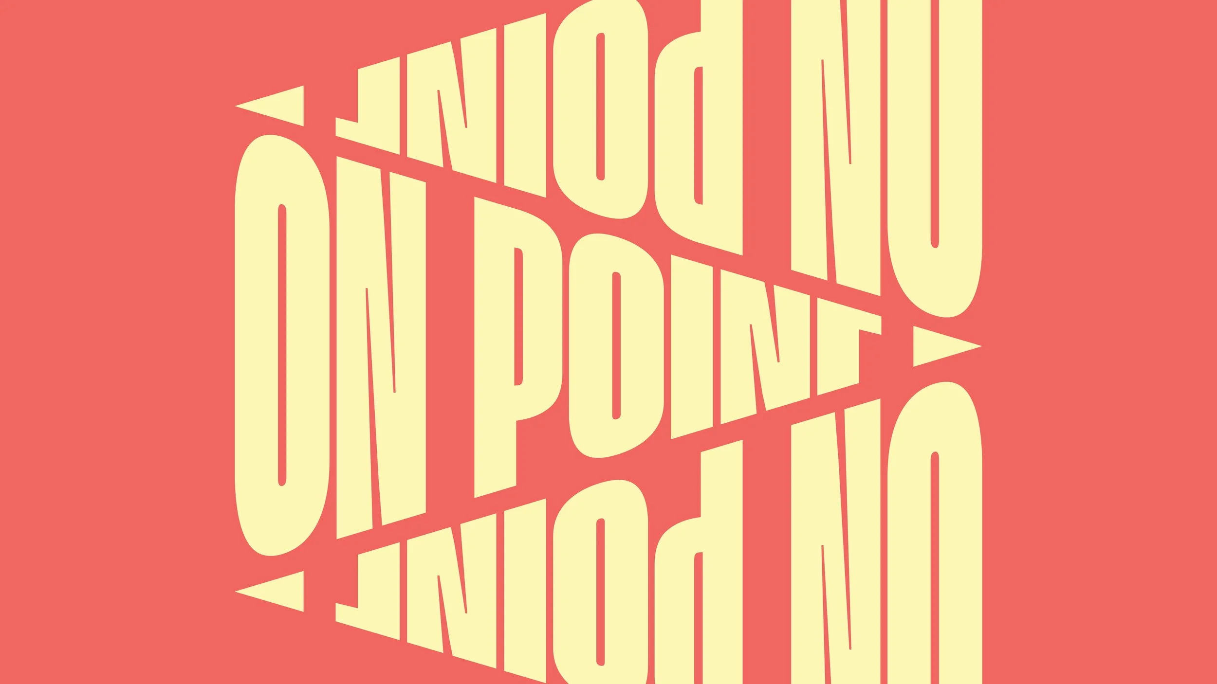
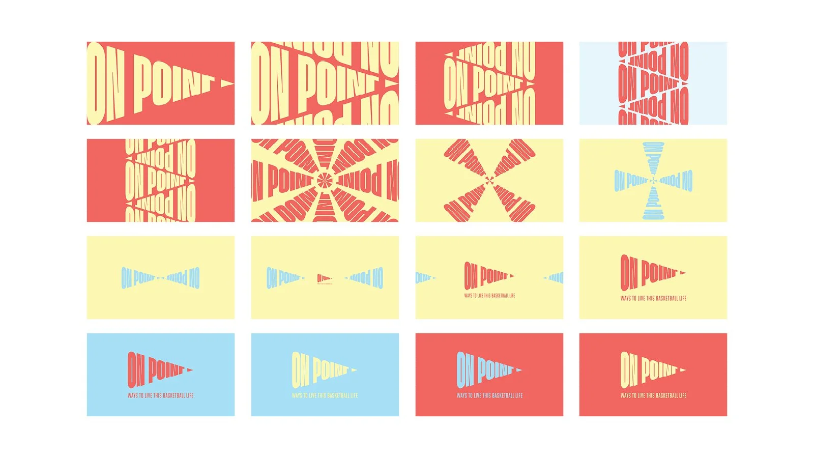
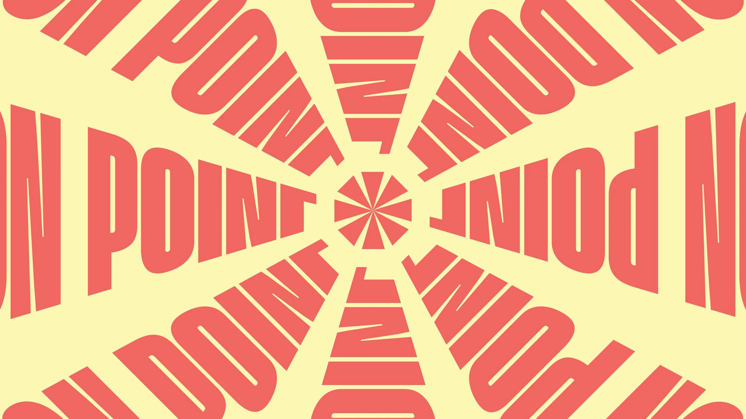
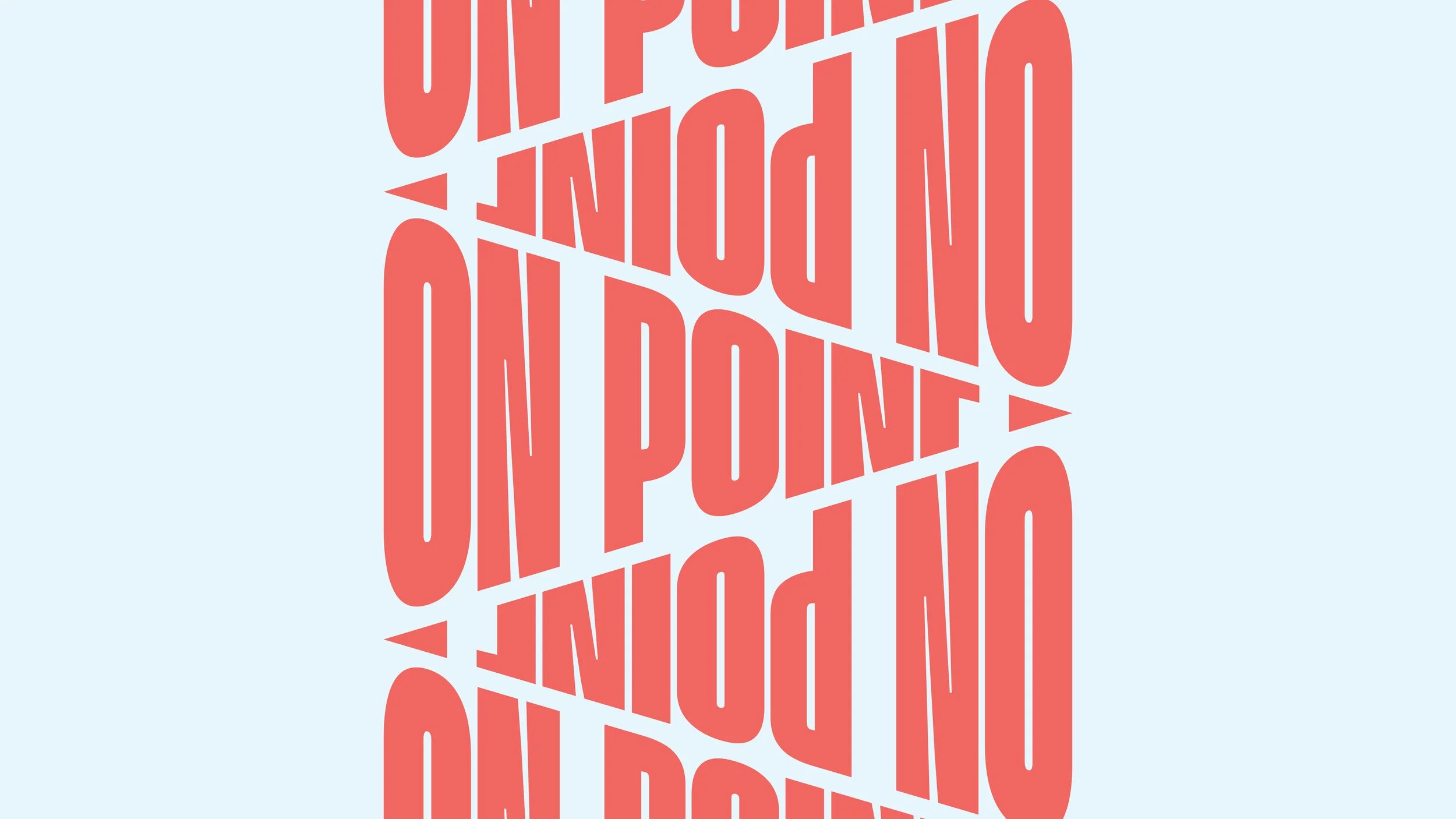
Built the visual language around precision and focus, using forward-leaning typography and arrow motifs to represent movement and progress.
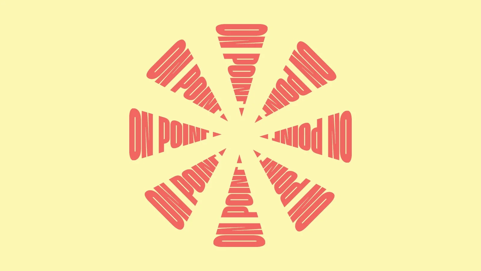
Designed the brand to have no limits — the logo itself could be rotated, stacked, and repurposed into bold patterns.
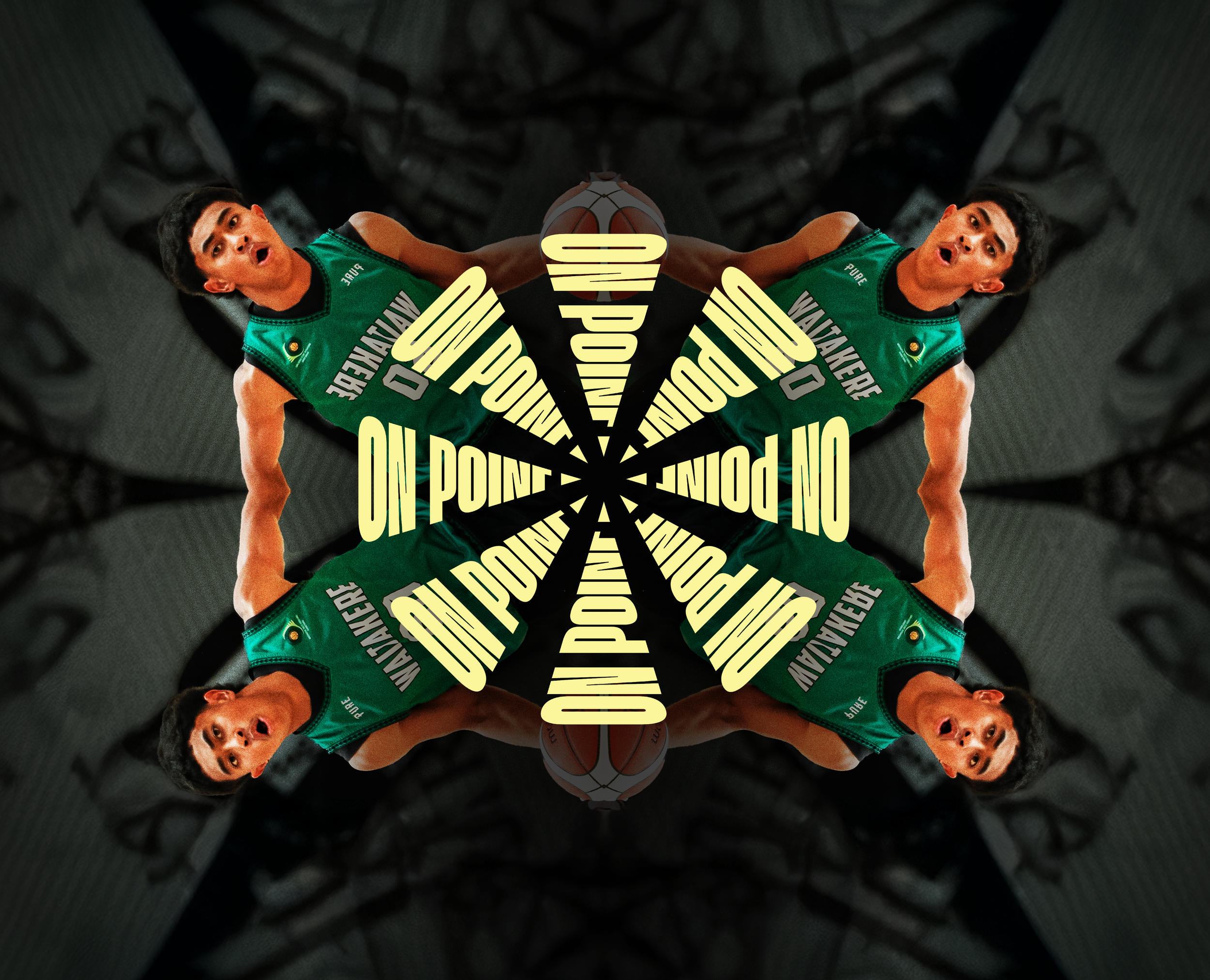
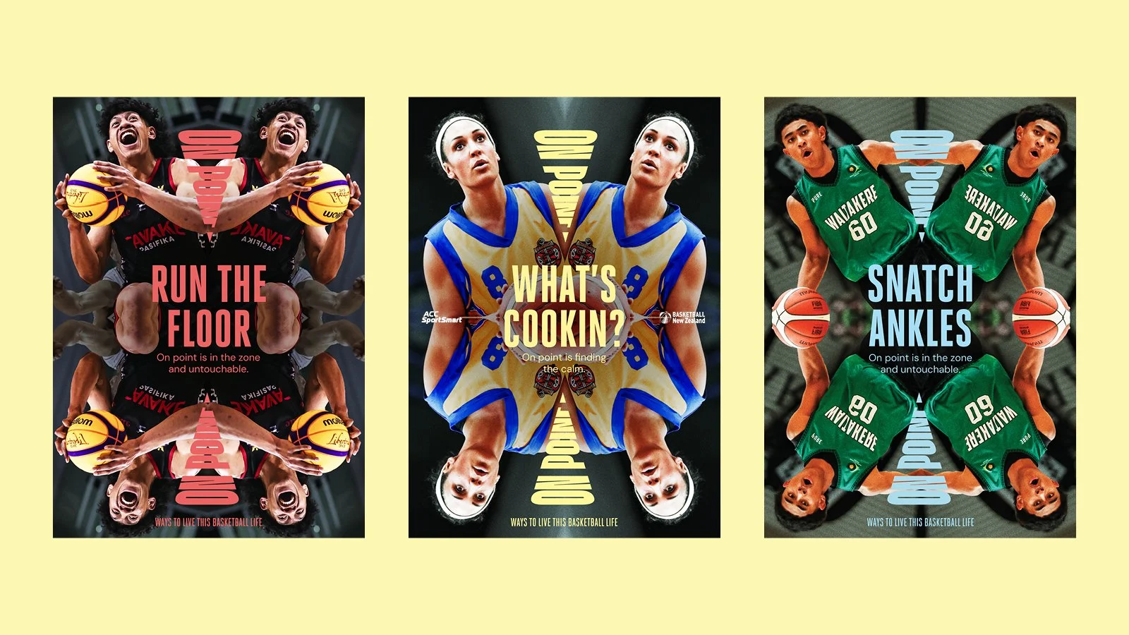
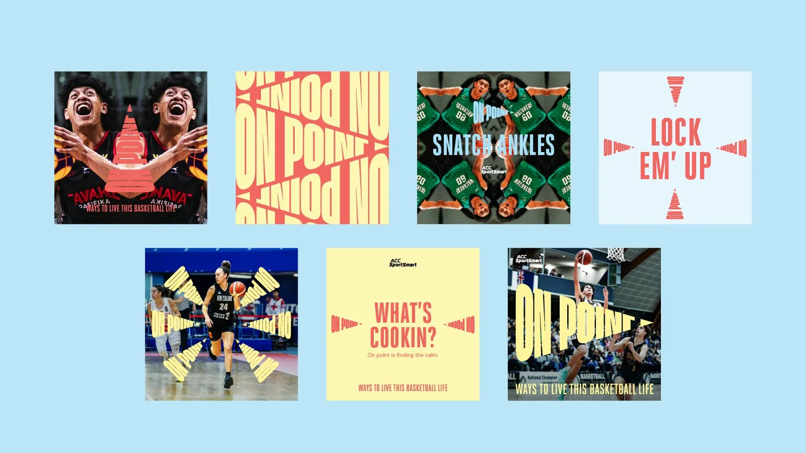
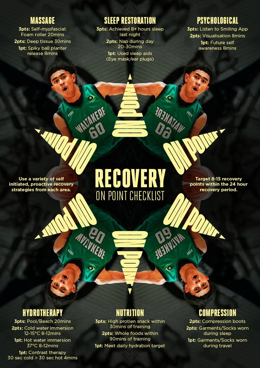
Established imagery guidelines that included grading, noise overlays, and creative effects (e.g. mirror effect) to elevate even everyday photos into striking visuals.
The Solution
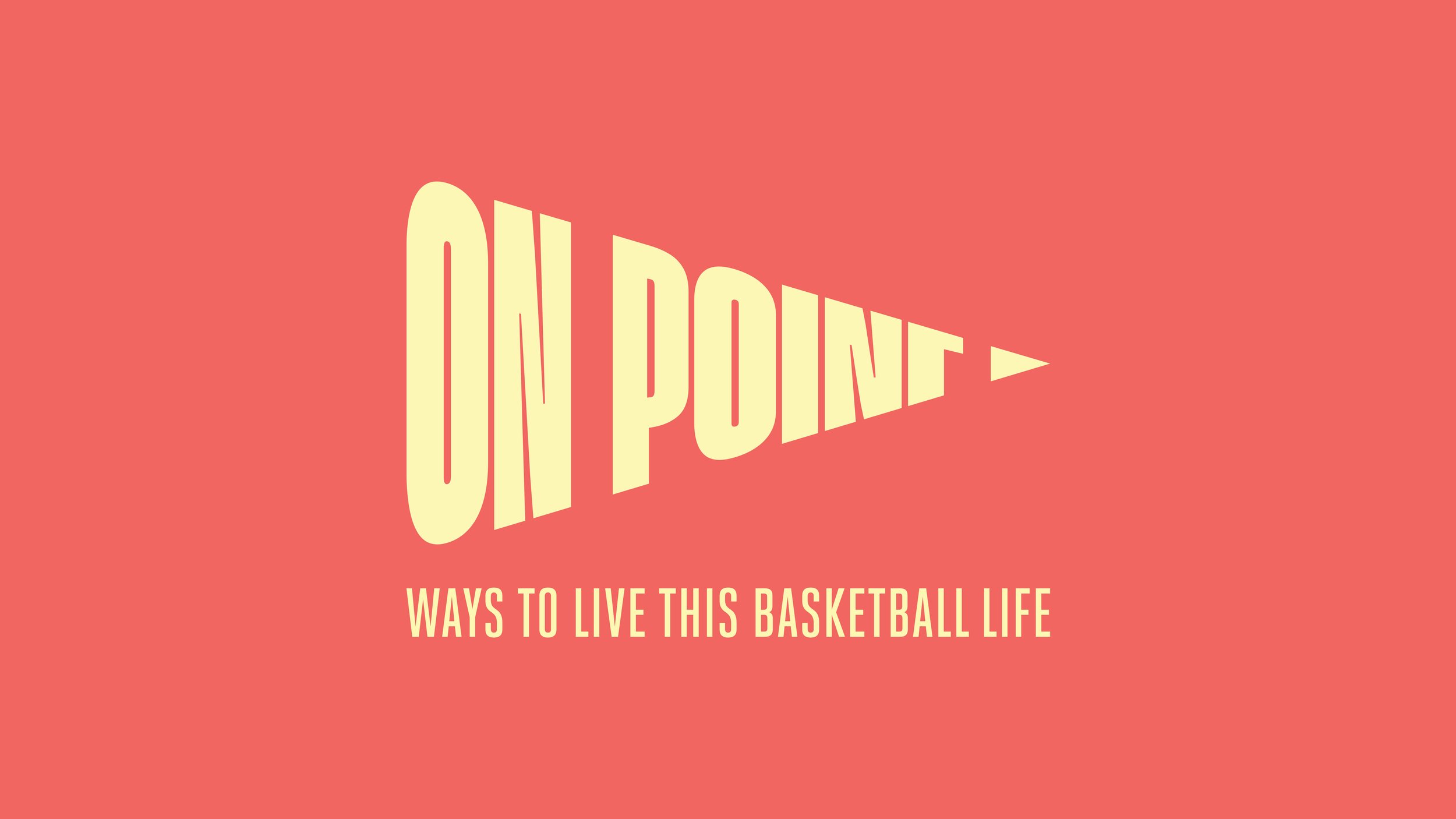
Logo: A bold, slanted wordmark symbolising precision, progress, and ambition, with a flexible system for playful adaptations.
Colours: Crafted a vibrant colour palette, to resonate with youth culture and modern design trends.
Imagery: A distinctive visual style using grading, lifted highlights, and noise overlays, with a “mirror effect” for hero campaign imagery.
The Outcome
Delivered a brand that feels sharp, youthful, and unapologetic, resonating strongly with young people while carrying the mana of the kaupapa.
Provided ACC and On Point with a flexible, future-proof brand system that can grow alongside the programme.
Set up a visual style that empowers schools, clubs, and communities to use the brand creatively without losing consistency.